
Product Photography Guide for Premium Listings
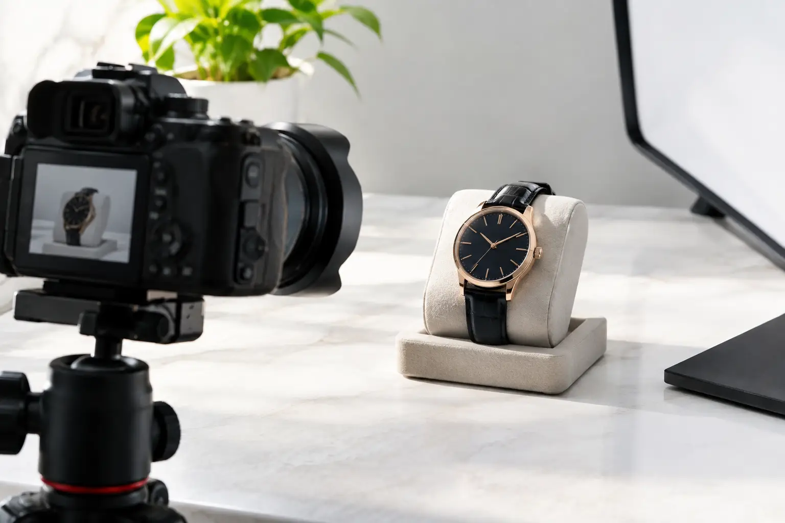
A shopper cannot feel the weight of a ceramic vase, test the softness of a throw, or hold a new smart device before purchasing online. Your images have to carry that responsibility. A strong product photography guide is not about making every item look artificially expensive. It is about presenting quality clearly, styling it with intention, and giving customers the confidence to choose.
For premium ecommerce, photography is part of the product experience. It signals care before a customer reads a specification, compares a price, or adds an item to their cart. Whether you are presenting home accents, fashion accessories, beauty essentials, pet products, or advanced tech, polished imagery turns browsing into desire.
Start With the Product Promise
Before setting up a camera or backdrop, identify what the product should communicate at first glance. A portable power station may need to feel capable, clean, and ready for real life. A sculptural table lamp should feel warm, refined, and at home in a considered space. A beauty tool may need to convey precision, ease, and an elevated daily ritual.
This decision shapes the entire shoot. Ask what a customer needs to notice first: material, scale, color, texture, function, or the lifestyle it supports. A product with distinctive craftsmanship deserves close detail images. A compact organizer needs context so shoppers can understand its capacity. Fashion items often need both clean catalog views and styled imagery that shows proportion and movement.
The goal is consistency, not sameness. Your catalog can span many categories while still feeling curated when every image has a clear visual hierarchy, believable color, and thoughtful finishing.
Product Photography Guide: Build a Reliable Setup
You do not need a huge studio to create high-end product images. You do need a repeatable system. Inconsistent lighting, rushed styling, and mixed backgrounds make even excellent products feel less considered.
Choose a dedicated shooting area where you can control the light. A table near a large window can work beautifully for smaller products, especially when direct sun is softened with a sheer curtain or diffusion material. For dependable results at any hour, use continuous LED lights with a softbox or large diffuser. The larger and softer the light source, the smoother the shadows and reflections tend to be.
A basic setup includes a camera or current smartphone, tripod, clean backdrop, light source, reflector, and a few styling tools. A tripod is particularly valuable because it keeps framing identical between shots and lets you use slower shutter speeds without blur. For polished ecommerce work, that consistency is worth more than buying the most expensive camera body.
Use white, warm gray, pale stone, or a subtle textured surface based on the collection. Pure white backgrounds are excellent for primary listing images because they are clean and easy to scan. They can also be unforgiving: poorly controlled light can make a white product disappear into its background. Add gentle edge definition with a reflector, side light, or slightly darker backdrop when needed.
Light for Shape, Not Just Brightness
The most common product photography mistake is treating brightness as the goal. Good lighting is about shape. It reveals the curve of a bottle, the grain of wood, the weave of fabric, and the brushed finish of metal without creating harsh glare.
Start with one key light placed at a 45-degree angle from the product. Watch where the shadow falls and how the surface responds. Move the light before changing camera settings. A small shift can turn a flat image into one with dimension.
Use a white foam board or reflector opposite the light to soften heavy shadows. Use black foam board when a reflective product needs more definition. This may seem counterintuitive, but dark reflections can help chrome, glass, and glossy black electronics show their edges clearly.
Reflective and transparent products require patience. Do not aim a bare light directly at them. Instead, light the surrounding diffusion material, then let the product reflect that soft, even surface. For glassware, a bright background with dark cards at the sides can create crisp outlines. For metallic accessories, look for clean, controlled reflections rather than trying to eliminate every reflection completely.
Capture the Views That Answer Buying Questions
Every image should earn its place in the gallery. Begin with a clean hero image that shows the complete product without visual competition. This is usually the image customers see first, so make it accurate, well-lit, and easy to understand at a glance.
Then build a sequence that removes uncertainty. Include front, back, side, and top views where relevant. Add close-ups for materials, hardware, stitching, controls, ports, packaging, or signature details. If the product has moving parts, show them in a way that makes the function immediately clear.
Scale is especially important online. A well-styled lifestyle image can communicate size more naturally than dimensions alone. Show a small speaker on a nightstand, a storage basket beside a sofa, or a travel accessory in a real packing scenario. Keep the setting intentional and uncluttered. The product should remain the point of the image, not become a prop inside an overly busy room.
For apparel and wearable accessories, include a mix of flat lay, mannequin or model, and detail photography when possible. Flat lays clarify the piece. On-body images show fit and proportion. Details communicate quality. One format rarely does all three jobs well.
Style Lifestyle Images With Restraint
Lifestyle photography is where a broad catalog becomes a lifestyle destination. It gives customers a reason to imagine the product in their own home, routine, workspace, or weekend plans. But premium styling depends on editing choices as much as adding beautiful objects.
Choose props that support the product story. A linen napkin can complement elegant kitchenware. A book and soft textile can frame a bedside lamp. A neat work surface can give an Apple accessory or smart device a sophisticated context. Avoid using props merely to fill empty space.
Use a limited color palette. Neutrals, natural materials, and one considered accent color often photograph better than a crowded mix of trends. Watch for visual distractions such as wrinkled fabric, fingerprints, crooked labels, tangled cords, and background objects that appear to grow out of the product. These small details can quietly weaken a premium impression.
It also helps to create styling rules for each category. Home goods may use warm, lived-in surfaces. Beauty can favor clean, luminous compositions. Tech often benefits from streamlined settings with graphic lines and controlled shadows. A consistent category approach makes a large marketplace feel more expertly curated.
Set Your Camera or Phone Up for Accuracy
A dedicated camera offers more control over lenses, depth of field, and file quality, but a recent smartphone can produce excellent ecommerce images in the right light. The better choice depends on production volume, product size, and the level of detail you need. A smartphone is fast and accessible. A camera becomes valuable when you need highly repeatable results, crisp close-ups, or more sophisticated lifestyle scenes.
Whatever you use, clean the lens before every shoot. Keep the camera level and avoid ultra-wide settings that distort proportions, especially for furniture, bags, and electronics. Use the main lens rather than digital zoom, then crop thoughtfully during editing.
For products on a clean background, keep enough of the item in focus that customers can inspect it. For lifestyle scenes, a softer background can add depth, but do not blur away useful context. If a product’s size or use depends on surrounding objects, those objects should remain recognizable.
Edit for Trust, Not Fantasy
Editing is where a set of good images becomes a cohesive collection. Correct exposure, straighten lines, remove dust, crop consistently, and adjust white balance so colors look true to life. If a cream pillow becomes bright white or a sage accessory shifts to blue-green, customers may feel misled when their order arrives.
Retouch distractions, not reality. Remove minor lint, fingerprints, and temporary blemishes caused by the shoot. Do not erase meaningful texture, change the product silhouette, or make materials look unlike the item being sold. Over-editing can produce a striking thumbnail and a disappointing delivery experience.
Create a simple editing standard for brightness, contrast, background tone, cropping, and export size. This speeds up future shoots and gives collection pages a more luxurious visual rhythm. It also makes it easier to add new categories without losing brand cohesion.
Make Image Consistency Part of Merchandising
Photography should not end when the files are exported. Review images where customers will actually see them: search results, collection grids, product pages, and mobile screens. An image that looks beautiful at full size may be too dark or too busy as a small thumbnail.
Lead with the clearest primary image, then arrange supporting shots in a logical order. Product details should appear before heavily styled inspiration shots when shoppers need practical reassurance. For a more design-led purchase, such as decor or fashion, a captivating lifestyle image may deserve an earlier position. The right order depends on how customers evaluate the item.
For Bluurban, every gallery is an opportunity to make everyday shopping feel more considered. A useful product photographed with elegance is no longer just a practical purchase. It becomes part of a better-looking, better-functioning life.
Set aside time to test one change at a time – a softer light, a cleaner crop, a more useful scale image – and let the results guide your next shoot. Small refinements are often what make a product feel ready for its close-up.








Leave a comment